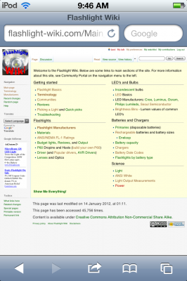
I was able to have a new theme for the blog activate for people using mobile devices like iPhones or Android devices. It gives a simpler layout that is easier to read on a small screen. I thought it would be nice to find something like that for the Flashlight Wiki as well. Again, the built-in browser for my iPod tends to show a page as if the screen is normal size, shrinking everything down. Then you have to zoom in to read things and pan around to read lines of text. So a simple interface would be nice.
Wikipedia has a special version of its site available that starts http://en.m.wikipedia.org that is meant for mobile users. MediaWiki calls themes “skins” but Wikipedia’s mobile site is something more complicated. A lot of the features of Wikipedia are very complicated, starting with the front page and all of their infoboxes and automatic conversions from or to metric and english units. It looks great on Wikipedia, but it is hard to implement on a personal wiki. So I know it is possible to get good results on a shrunken screen because when I visit Wikipedia on the iPod, I see the mobile version.
But when I visit my site, I get this:

