I was able to have a new theme for the blog activate for people using mobile devices like iPhones or Android devices. It gives a simpler layout that is easier to read on a small screen. I thought it would be nice to find something like that for the Flashlight Wiki as well. Again, the built-in browser for my iPod tends to show a page as if the screen is normal size, shrinking everything down. Then you have to zoom in to read things and pan around to read lines of text. So a simple interface would be nice.
Wikipedia has a special version of its site available that starts http://en.m.wikipedia.org that is meant for mobile users. MediaWiki calls themes “skins” but Wikipedia’s mobile site is something more complicated. A lot of the features of Wikipedia are very complicated, starting with the front page and all of their infoboxes and automatic conversions from or to metric and english units. It looks great on Wikipedia, but it is hard to implement on a personal wiki. So I know it is possible to get good results on a shrunken screen because when I visit Wikipedia on the iPod, I see the mobile version.
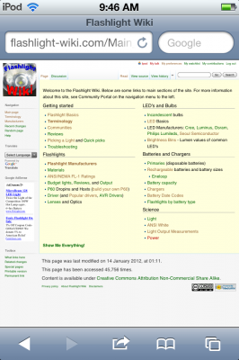
But when I visit my site, I get this:
I went looking for a new mobile skin, but it doesn’t seem like the one Wikipedia uses is available or is difficult to implement. However there is a user-submitted skin that took the WPtouch look I had just installed on the blog and converted it for wikis. I wasn’t sure how hard it would be to install a new skin, but it is just a zip archive that you unzip into the skins directory on the server. Now it is available to any vistor who wants to choose that skin in their preferences, but it would be more useful if the usual default Vector skin would show up for people using computers and WPtouch would show up for mobile users. At one time there was an extension that did this, but the extension doesn’t work anymore so somebody just wrote up this line to put in localsettings.php that sets the default depending on the type of device:
## Default skin: you can change the default skin. Use the internal symbolic

## names, ie 'standard', 'nostalgia', 'cologneblue', 'monobook', 'vector':

if (preg_match("/(mobile|webos|opera mini)/i", $_SERVER['HTTP_USER_AGENT'])) {

     $wgDefaultSkin = 'wptouch';

}

else {

     $wgDefaultSkin = 'vector';

}
It works pretty well, but still needed some tweaks. I noticed the background was concrete instead of the little vertical pinstripes that most iPod apps use. I was able to change this in the WPtouch.php skin file by changing this line:
<body class="skated-wptouch-bg">
to this:
<body class="classic-wptouch-bg">
One problem I had was there is a little icon that goes on the toolbar and it was showing up as broken. I found out in main.css (since this is all experimental, I’m editing the actual files instead of trying to make css changes in the wiki itself; plus I tried making changes to a new wiki page called MediaWiki:WPtouch.css and they didn’t work) that the graphic it was looking for was apple-touch-logo.png and I didn’t have one. Instead I pointed it to favicon.gif in the images folder that I already had. It is just a 4-color gif version of favicon.ico. At first I just pointed to favicon.ico and it worked fine, but I tried the gif to get my offline browser to read it, but the image still shows up broken. Browse Later also ignores the background image below.
The main.css file wasn’t formatted like a regular css file, so I changed it. There are a ton of styles in there related to WordPress stuff that I am sure I don’t need, but I don’t want to get rid of something I might need later. I did have to add this section close to the top to get the link colors the way I wanted, but if I put it at the bottom it overrode even the links in the drop down menu.
/* Modify all links to be green/brown, then make external links blue/purple */

/* Also need to modify MediaWiki:Vector.css to affect sidebar links */

a:link                  {color: #006600;}     /* dark green */

a:visited               {color: #996633;}     /* brown */

a.external              {color: #0000ff;}     /* blue */

a.external:visited      {color: #800080;}     /* purple */

a.new, #p-personal a.new {

     color: #ba0000;}                         /* red */

a.new:visited, #p-personal a.new:visited {

     color: #660000;}                         /* dark red*/
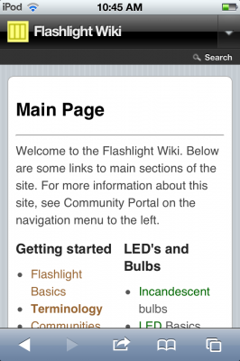
Anyway, here is how the site looks now:
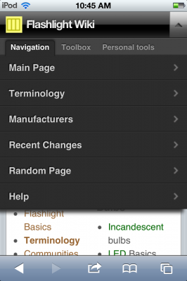
 Like I said, the header at the top is a drop-down toolbar with all of the items that would go in the sidebar or tabs. So here is what that looks like:
 Pretty cool. Except I notice that after visiting a few pages, sometimes the Vector skin will pop up. Not all of the pages, just some of them. This seems to be because I have the wiki set to cache pages instead of creating pages on the fly from the database. Maybe it is pulling up cached pages that use the Vector skin by default? I got around this by setting up a new user account called iPod and set my skin preference as WPtouch and it seems to always give me WPtouch now. But then I went to my other computer and pulled up the wiki and got the WPtouch version of the home page! That was unexpected. It still looks pretty good on a full size screen, but I don’t want visitors who are not logged in to ever see WPtouch. Maybe some of the mobile versions of the pages were cached? I went ahead and turned off caching the pages which may make the wiki run a little slower, but it seems to fix the issue of the wrong skin showing up.
I noticed on the iPod the text is a little small and Safari, unlike just about any browser, does not allow the user to control text size. I went in to main.css again and found some references to body and li text and set those to 18px. Much easier to read. 18 pixels seems huge, but the iPod’s pixels are very small.
Also it wasn’t rendering images quite right. One nice thing about Wikipedia is the way it puts images in boxes with captions. So I went to Vector’s css and copied the section that renders thumbnail images and added that to WPtouch’s css file. This mostly works except the boxes seem to spill over the right margin. I played around with setting the maximum image width to 300px, but the boxes are still the same size, so somehow the box is tied to the image size. It is still an improvement because the caption text is visually separate from the article text and before you couldn’t tell. Also the text doesn’t wrap around the image, but I don’t care about that too much since there is no room to wrap anyway.


I wondered what the blog and wiki would look like on an Android phone. I found some software called Mobilizer at springbox.com that seems to run emulators suing Adobe Air, which I had never heard of before but seems to be some kind of Flash platform.
http://www.springbox.com/mobilizer/