
I was thinking about jazzing up my movie reviews website. I figured the easiest way to do this would be to add a stylesheet which could apply background colors, text styles, and snazzy layouts to the whole site easily. I went and looked for some sample stylesheets to see what I could do. I have worked with stylesheets on the blog and on the wiki and they get kind of complicated, so I just wanted something simple. But I would need to add some additional tags to the movie reviews to make it all work.
The way the movie review site works right now is all of the reviews are stored in a Microsoft Access database and then I can create all the pages of the website by pushing a couple of buttons in the database. Then I just need to upload the files to my server. This is different from how the blog and wiki work. They store the files in a database on the web server. You enter a blog entry or wiki article and it is stored in the online database. The blog and wiki use php code and SQL databases. It’s not insanely complicated, but I don’t want to have to write all of the php from scratch. So I wanted to stick to Microsoft Access.
The problem with Access is that every little snippet of code that goes into the web pages has to be written out in almost equation form and things like quote marks aren’t allowed, so you have to set up a variable for quote marks. It’s a lot of string functions to put the source code together correctly. But you only have to do it when you’re setting things up.
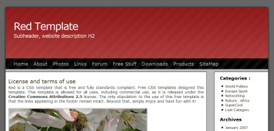
So I found a nice stylesheet for free on the web and it was pretty simple, similar to the blog with a header at the top, some content on the left, and a menu along the top and right. I wanted to customize it a little, so I started playing around with the stylesheet and the sample html file to customize it. I didn’t need the menus, for instance. I just wanted the clean look. And I changed a few colors and simplified the graphics. Also I like having the grade I give the movie as a big letter at the beginning, so I added that to the stylesheet. I was just playing around with the sample files, not trying to do this in the database yet.
But I thought it would be kind of neat to have the menus for navigation and they looked pretty good. I just didn’t want to put all that coding into the database and you can’t really generate text or links using a stylesheet. Then I thought maybe I could start with a template and insert the movie reviews into the template. Really, what you have to do is read text from a template file with HTML in it and write that to an output file, then insert the movie title and review into the output file, then read another template file wih more HTML, and write that to the output file. This actually simplified things a lot and meant I could make big changes to the look of the website just by messing around with the stylesheet and/or the template files. Then I would re-create all the web files and upload them.
One complication is that individual movie reviews are stored in subfolders for their year, but the archive lists are in the main folder. So when I have a link to another page, I had to add a ../ to the pages that are movie reviews so they would bump up a folder level before going to the correct year subfolder. This meant I needed separate templates for movie reviews (with bump ups) and for the indexes (without), but that’s not so bad either. It just means that when I want to make a change, I have to make that change to two different templates.
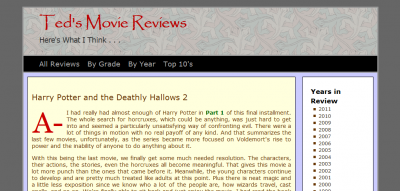
Anyway, I think it turned out pretty well so far:
http://igirder.com/movies/index.html
Looks good, but I don’t recall the “before” look. Can you insert a before thumbnail as you did with the template and the final look?
Where are all of your 2012 notes?
MovableType also generated html pages. I liked that because it meant I could back up all of the html pages and images, and the site would work run off a local drive or DVD backup, even if you did not have the source databases. But those were the old days.
P.S. I recently read the history of IMDB. I did not realize Amazon had acquired them, and that was way back last century!
http://www.imdb.com/features/anniversary/2010/letter
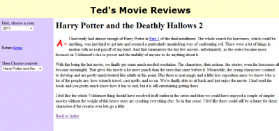
Originally I had a version with frames where I had navigation frames on the left that let you choose a year and then a movie in that year (I’ve added a “before” screen to the entry now). But I also had a version without frames where you just had to navigate from a home page which had links to alphabetical lists, top 10 lists, lists by grade, and lists by year.
I haven’t seen many 2012 movies. Most of the reviews I write now are from watching DVD’s or TV.
I made a few more tweaks to the site. The banner was a little big, so I made it less tall (easy change to style.css). Then I reversed the order of the Years in Review on the right so that the most recent year would be on top (edited one of the templates). Then in the database itself, I changed all the filename extensions to .html instead of .htm. Also I had it create the index.html page showing the 10 most recent reviews I’ve written. I felt like I needed some movie review links on the first page, and I’ve been putting in the date of when I write a review, but I’ve never used that field.
Made a few more tweaks and now I think I’ve got it where I want it. I made changes so it would be fully XHTML compliant, by enclosing text in paragraph tags and making sure I was using self-closing tags.
The alphabetical list was generated by cycling through all of the movies alphabetically and making links to each movie. If it detected that the first letter of the movie was different than the last one, it would add a header with that letter. So all the movies starting with A appeared under “A” and movies starting with B appeared under a “B” heading. One thing I didn’t like is that the movies that sorted to the top started with numbers, like 3:10 to Yuma or 8 Mile. So the program would generate a “3” header and an “8” header. It was a bad way to start a list. It would be better if those 5 movies were under a “#” header instead of separate headers for each number. So I was able to hard code in a “#” header and then use an IF statement to skip header writing for numbers.
I refreshed the look just a tiny amount today. Because it uses css, it was easy to fix one file and have it reflected on the entire site. First, I got rid of the narrow borders around the main body and right box. The trend lately seems to be to keep things flat. On the right is a list of years in review and by default the list had bullets, so I was able to get rid of those and it looks a little better.
A while back I added in whether I own the movie and in what format or formats. Also I added the year the movie came out next to the title, which maybe is helpful, opting against putting it in parentheses and just in a somewhat smaller font (which works better on a desktop screen than a phone).