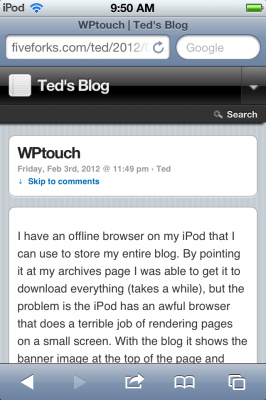
I have an offline browser on my iPod that I can use to store my entire blog. By pointing it at my archives page I was able to get it to download everything (takes a while), but the problem is the iPod has an awful browser, Safari, that does a terrible job of rendering pages on a small screen. With the blog it shows the banner image at the top of the page and then a thin, microscopic column of text for the blog entry. So you have to zoom in on the column, but it is a pain.
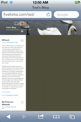 I started looking for solutions and found a plugin for WordPress that completely changes the look of the blog if you try to view it on a portable device. The plugin is called WPtouch and was specifically designed for the iPod Touch and iPhone, but works for Android and Blackberry as well. I don’t think it does anything for iPad, but that’s okay because the iPad has a bigger screen. Although WPtouch is free, they have a pay version called WPtouch Pro that gives you the ability to configure the look more and also control how it looks on an iPad. Well, I’m not going to pay, but I am very particular how things look.
It was really easy installing the plugin. Scary easy. It can all be done through the dashboard, though I had to do this via the network dashboard and now all the blogs are using it. I’m not sure if it can be turned off for different blogs or not. Since only the Pro version supports themes and child themes, all of the changes I made are reflected across all of the Mac5 blogs (if you’re looking at them on a portable device). It gives a clean and simple look that looks like an iPod app. Entries even get a little iOS calendar icon with a red circle indicating the number of comments, and different colors for each month.
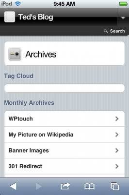
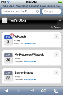 I entered the URL of my archives page to see a list of all the entries. Unfortunately the list was just all of the months and you could click on a month and go to a page with the archives of that month. My regular archives page is a list of all the entries, but WPtouch was overriding that and giving me the default archives. To fix that I had to edit the page.php file and give the following function an argument instead of being blank:
wp_get_archives('type=postbypost')
So now I have a nice list of entries. After I did this screenshot I commented out the tag cloud in page.php and changed the subheading from “Monthly Archive” to “All Entries – Newest to Oldest”. The heading also has a Search tool available.
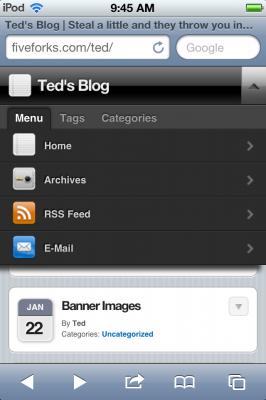
 There is also a configurable drop-down menu. I got rid of this on my regular blog, but because there are no sidebars here, it could be useful. So far the only thing I’ve added is a link to my archives. The other items were already there.
 You go to an individual entry and it looks great on the iPod, very easy to read.
 At the bottom is a toggle to show the comments. I went ahead and told my offline browser to go get the blog. I got tired of waiting for the entire download, so canceled part way through to check things out. It turns out that WPtouch was kicking in like it was supposed to, but the comment toggle wouldn’t work offline and I wasn’t able to see the comments. I don’t want to miss out on that. There doesn’t seem to be a lot of help for configuring all of this and the company that wrote it wants to steer you into paying $50 for the upgraded version. However I did find in the style.css this little snippet and edited out the part that hides the list:
ol#commentlist {

list-style-type: none;

/*    display: none;*/

margin: 0 10px 0;

position: relative;

padding-right: 0;

padding-bottom: 0;

padding-left: 0;

}
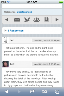 So the toggle (the little triangle next to “6 responses”) is still there, but I disabled it by getting rid of the on_click snippet in comments.php. At the end of each entry there is a tool bar that lets you go to previous or next entry or email, tweet, or bookmark the page. For some reason, the date of the comments wasn’t shown as a date, but as how long ago (“5 days and 4 hours ago”), which is useless for a lot of really old posts. I’d rather just see the date. So, after much struggling, I wiped that part out of comments.php and put in the following:
<?php comment_date( 'M jS, Y @ h:i a'); ?>
from this:
<?php if (function_exists('wptouch_time_since')) {

echo wptouch_time_since(abs(strtotime($comment->comment_date_gmt . " GMT")), time()) . " " . __( 'ago', 'wptouch' ); } else { the_time('F jS, Y'); ?>
Since I was formatting dates and I usually like to have the day of the week in the date format, I added a l (lower case L) and comma to the format of the entry in single.php
As with Twenty Eleven, I wanted to get rid of the site description (the rotating quote) from the title of the page. I was able to delete a couple of lines from the core-header.php file to do that. Now when you visit the home page the title is just Ted’s Blog.
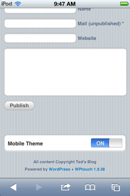
At the bottom of each page is a switch where you can go back to the blog’s original look if you want. But if you do, it still leaves a switch at the bottom so you can go back to WPtouch’s look.
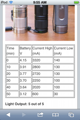
 I was worried that some pages with a lot of formatting might not look right, but it brings over images no problem and here is a table:
 It even dealt with the iPod Timeline entry which has some custom styles and uses definition lists:


Hmm . . . The offline browser (called Browse Later) isn’t picking up the comments for some reason, even though they show up in Safari.
I cleared out all the offline files and did it over again (just downloading the home page instead of the whole blog which takes too long) and it seems to get the comments now.
I was looking for something similar that I could put on my wiki. It turns out there is a WPtouch skin for wiki’s. You add an IF statement to localsettings.php to default to that skin if the device is portable, otherwise use the regular skin. And it works fine. Well, not quite. Some tweaking was necessary, which you can read about here.
There was an update of WPtouch that came out yesterday, so I installed that and had to do all of this stuff again. Glad I had it written down because it turned out to be a lot to do.
Can the page css be changed? i.e. I want the desktop theme which is dark to display a lighter font color and the mobile theme which is light to display a darker font color. I want the css to force the page font color to black. Is that possible, if yes, how?
Desktop computers and mobile devices are using completely different skins, so you can change the css on both of them separately any way you want. The post above gives examples of some things you can change, but not specifically how to change the color of the font, so you will need to figure that out. Start with the style.css file of WPtouch.
I upgraded to the latest version of WPtouch today. Had to do all of this over again, so it’s good I had written it all down.
Thank you. This is very helpful. If you’d like to display comments by default but still keep the onclick event to collapse them so the user can get to the bottom quickly to enter their own comments, just add class=”comhead-open” to the tag and add class=”com-arrow-down” to the tag.