
A few years ago, I wrote about my Deferred Compensation Plan at work and said that at the time, I was averaging a 7% return over the previous 13 years. Since Jeb posted his Green in Wintertime post, I thought I would post this graph which comes from a spreadsheet I use to keep up with how much I have contributed, how much my account is worth and the difference between the two which is the gain or loss.
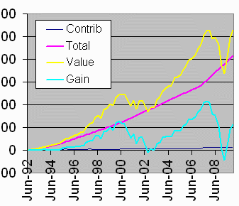
You always want the yellow line (the current value) to be above the pink line (total of my contributions). If the yellow dips below the pink, I am losing money. It has happened twice, but is not happening right now. The neat thing that happened in June 2000 was the blue line (gain or loss) crossed the pink line. That meant that my gains exceeded my contributions, or, in other words, I had doubled my money! At the time I had an average annual return of 33%, which was clearly unsustainable. About two years later, I had lost every penny of my gains and was showing an average annual loss of 1.18%. Five years later, I was showing a lifetime average gain of 11.3% but nowhere close to doubling my money yet. 18 months later, I had lost all my gains again and had an average loss of 0.31% per year over the previous 16 years. Now I’m showing a gain again of 4%, which is pretty lousy, but I’ll take it. Though the account value is back to where it was before the 2008 crash, you can see that today’s gains are about half of what they were then.